

Overall Score: 9.3 / 10
Goal fulfillment
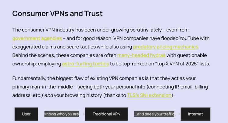
The goal fulfillment here is top-notch. The visitor is supposed to try a VPN, and it is explained right at the beginning what is different about this VPN compared to other VPN providers. Two call-to-action buttons are in view; one above the fold and one in the website header visible on every other page.
Clicking the orange button immediately triggers a download of the VPN client and shows a page with the simplest installation instructions (for Mac users).
If you scroll further down the same page, it is also explained with clear animations how Obscura differs from other VPNs. Additional information, FAQs, and an introduction to the development team and the person responsible for the project with their full name round off the page.
Honestly, I don’t know what else could be improved here.
Score: 10/10
Technical appropriateness
The website is pure HTML/CSS/JS, the animations are made with CSS3, run smoothly, and are absolutely appropriate.
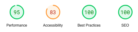
Google PageSpeed Insights is also impressed with the performance and SEO.
There is nothing to criticize about the technology used.
And the payment option via Bitcoin Lightning is almost a must for a website that links to the Cyberpunk Manifesto in the footer.
Score: 10/10
Visual Design
The design is bright and friendly. The animations are functional, as I mentioned before.
The pixel style is nothing new since Minecraft, but at least the website, logo, and client design are consistent.
Score: 10/10
Usability
Usability is not only about the tactile use of the website but also about the chosen form of presentation. Everything is good and would also receive full score from me. However, there is one thing that stands out to me and could have been better addressed: the price presentation.
It is linked at the top in the main navigation, which is good, but the link leads to a point in the FAQ accordion. This is functional, avoids redundancy, and is sufficient. However, it’s not what users are accustomed to from other websites. I know I am nitpicking a detail from an otherwise excellent website, but prices should be displayed prominently and boldly. After all, it’s the next thing the user looks for after being convinced to try it out.
Improvement suggestion: Simply create a dedicated section on the homepage with the price information. Display the price in a new red color, strike through the $8 in smaller text, and show the current offer of $6 in large text. Then include all the other payment information that is in the accordion point. Why? The price should also be easily visible just by scrolling, without the user having to click on the accordion title or menu item.
Score: 9/10
Accessibility
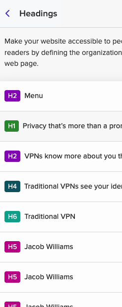
There are a few accessibility issues. For example, the heading hierarchy is not correct, which is a common navigation tool and also an important feature of a good DOM structure.
Using “Here” as a link title multiple times on a page is never a good idea. Screen reader users have a function that can read all the links on a page along with their titles. The link labels should be understandable on their own.
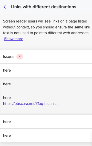
So instead of “More technical details here,” it would be better to say “More technical details.”
Some contrasts, particularly orange links on a light blue background, are also insufficient.
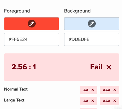
This is particularly relevant for color blindness with green weakness, which exists in 1% of the population.
There are also a few issues with the newsletter signup form.
As part of a light test, I am not conducting a deeper analysis or a real screen reader test. But these are the basic issues that need to be addressed.
Score: 7/10
Communication design
The communication style, with initially little technical terminology and simple sentences, is perfectly fine. This should also be understandable for non-native speakers.
Score: 10/10
Ethical Analysis
The CEO of the company introduces himself and his team right on the homepage. This is good.
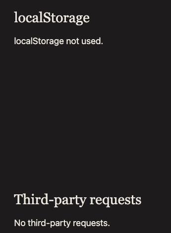
No third-party resources are integrated, and no data is stored in localStorage. This is rare nowadays and excellent!
A cookie consent banner becomes unnecessary with this approach. However, I would still recommend having the legal texts checked by a specialized lawyer regarding compliance with the European GDPR. This is also applicable to non-European companies that offer commercial services to European customers.
The only ethical shortcoming here is the obligation to inform users when collecting email addresses in the newsletter form. While it is fairly stated that the same content can alternatively be accessed via RSS and on X (why not also on Nostr?), a few more details would be in good taste. For example, what type of content will be sent (I assume only new blog posts?), how often will it be sent, and can users unsubscribe? Which tool is used to collect the email addresses? Is it a third-party service or an in-house system? If it’s a third-party service, which one is it, what data do they collect, and has a Data Processing Agreement been established with them? Yes, GDPR is a complex matter.
Score: 9/10
Overall Score: 9.3 / 10
0 Comments