

Overall Score: 7 / 10
Goal fulfillment
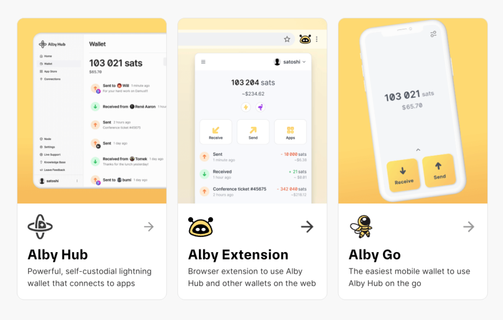
The goal of this website is for users to sign up and use one (or all) of their three main products: Alby Hub, Alby Extension, and Alby Go.
The homepage is honestly a bit confusing. Not for me, as I have known Alby for a while, but for first-time visitors, it certainly is. People, who seem to know more about selling online, advised me to focus on just one product or service. But what if you have more to offer? Well, you should have a main product and treat all others as secondary or complementary products. At least from a marketing perspective. There is some truth to that. From the provider’s perspective, it makes sense to present all products and services as clearly sorted as possible. However, the user wants it to be very simple and to recognize patterns they are used to from other websites.
So, which is the main product? I assume it’s the self-custodial Lightning wallet Alby Hub. Alby Go and Alby Extension would be the complementary products. And that is exactly what the homepage should focus on. The homepage getalby.com should prominently promote the Lightning service. The complementary products should be presented as visibly highlighted additional products. The “Products” menu item can remain, but Alby Go and Alby Extension should be highlighted as direct links in the top navigation row. And they should both lead to their own domains or subdomains. Or if they remain as their own pillar pages under getalby.com, as is currently the case, Alby Hub should also stay under getalby.com.
I would therefore suggest the three pillar pages under the following URL structure: Alby Hub -> getalby.com, Alby Extension -> getalby.com/extension, and Alby Go -> getalby.com/go. This also facilitates future advertising efforts in media other than the internet.
However, the information architecture is set up exactly the opposite. Alby Hub has its own domain, and the other two products are on their respective getalby.com pillar pages.
I would therefore recommend moving the content from the homepage of albyhub.com to getalby.com, plus perhaps adding the other products section further down.
I consider “Create Account” to be a suboptimal call-to-action. “Get Alby Hub” is better and aligns with the familiar pattern found on such websites. After all, you only need an account if you want to have Alby Hub hosted on Alby’s servers; it’s not strictly necessary for the other products.
This is just a structural suggestion. Of course, there would be additional details to follow.
Score: 6/10
Technical appropriateness
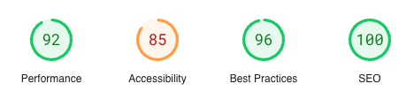
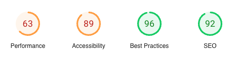
The website was apparently created with Framer, which surprised me a bit for a development company. But the result seems to be fine, so who cares? Google PageSpeed Insights has hardly any complaints on desktop, but there is still quite a bit of optimization to be done on mobile.
On desktop:
On mobile:
Score: 8/10
Visual Design
The visual design is professional and appropriate. They even publish their brand kit with logos, color codes, and fonts.
Score: 10/10
Usability
The usability of the external pages is good. Aside from the information overload mentioned before in “goal fulfillment”, there are actually no problems. The issue lies more in the dashboard area, which has often changed historically and has often confused me as an existing customer. For example, the many “settings,” especially when you have also installed the extension. Here, too, the reduction to one brings much more than distinguishing between settings in the dashboard, wallet configuration in the dashboard, and wallet settings in the extension, Nostr settings in the dashboard, and Nostr settings in the extension. While this may have a certain internal logic, it often leads to long searches for a specific setting, with no idea of how this logic is structured.
One should reduce it to one settings area and then include everything under that, possibly with cross-references to “in the web dashboard” or “in the local extension.” This distinction is important so that the user always knows what is stored locally and what is in the web (dashboard).
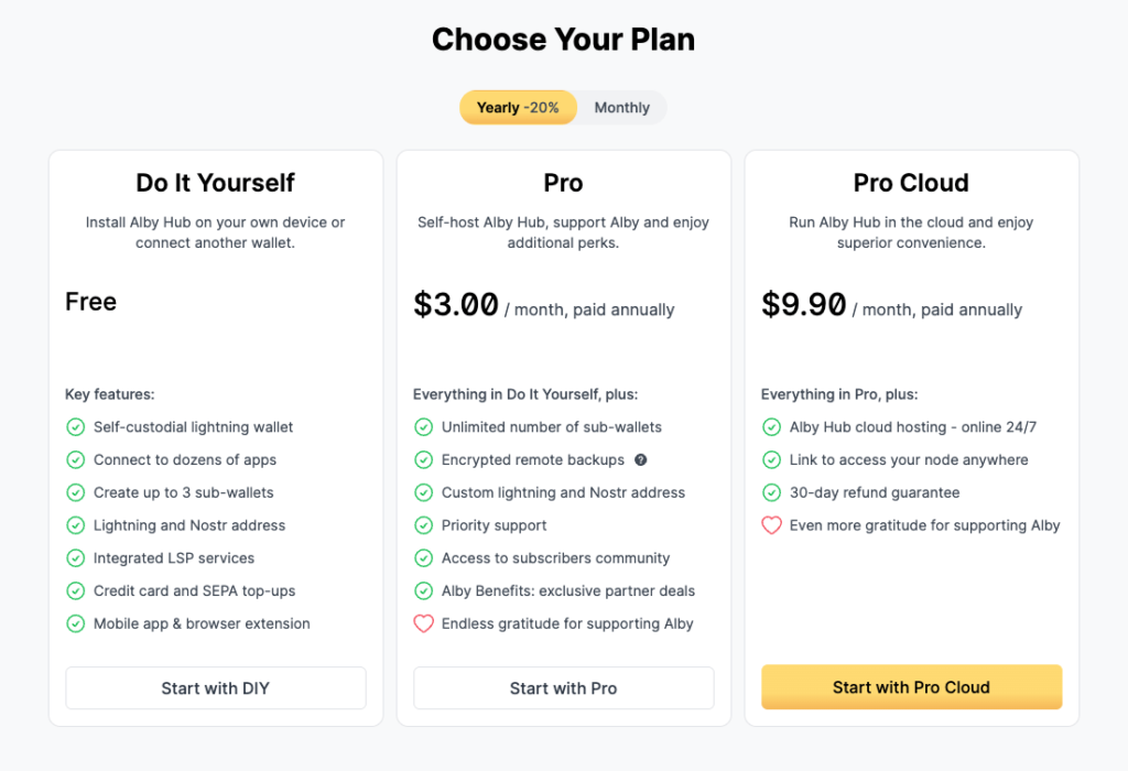
The pricing area is clean and clear. Alby may understand this “plan” as a pure price for hosting, but as a user, I want to know more. Specifically, “what will this all cost me?” In other words, what does it cost if I book the Pro Cloud? Just $9.90 a month? Or are there additional costs? For example, when I set up my Alby Hub and open the first Lightning channel. Does that cost anything?
That is the fine distinction between UX and usability, and why I am testing usability rather than explicitly testing UX in these evaluations. From the provider’s perspective, that is, from Alby’s perspective, everything is correct. They offer a hosting service and state how much it costs. However, from the user perspective, it should at least be mentioned that using Alby Hub and setting up the channel may incur additional costs for the user. That would be transparency in terms of usability. It’s not even mentioned in the FAQs that there may be additional costs involved.
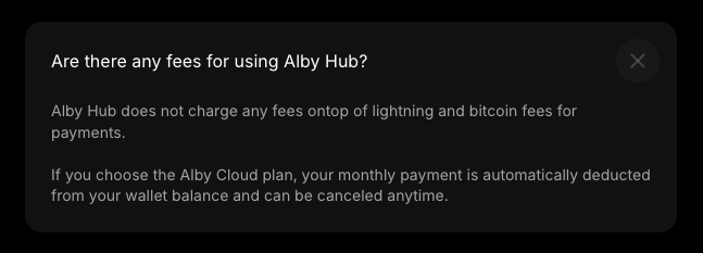
What I find more problematic is that I only see these prices after I have registered and logged into Alby. Starting from albyhub.com, the prices are listed at the top of the menu under “Pricing” on the getalby.com homepage. But why not more prominently on albyhub.com? That is, as it stands, the actual Alby Hub pillar page.
This adds to the confusion created by the poor content organization I mentioned in the “Goal fulfillment” section. If the getalby.com homepage is supposed to include all products—Alby Hub, Alby Extension, and Alby Go—then the pricing menu item should refer to all three products and not just one of them. Even if only Alby Hub incurs a cost, the other two at least cost $0, and that should be made clear.
On the homepage of albyhub.com, the prices for Alby Hub should stand alone and be fully inclusive of operation and setup. Otherwise, the user would have to switch back to getalby.com if they even know that the prices for Alby Hub are listed there.
Offer and price. Those are the two most important pieces of information, and there should be no confusion about them.
Score: 5/10
Accessibility
The accessibility is fairly good. The color contrasts are correct, with minor exceptions where yellow text appears on a white background.
The heading hierarchy is mostly correct as well, at least enough for navigation. However, one should not jump directly from H2 to H5 on getalby.com.
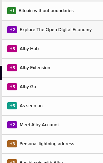
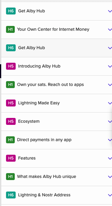
It’s worse on albyhub.com. There, the hierarchy starts with H6, the page has multiple H1 headings, and otherwise, no order is maintained. It looks like headings were used solely for formatting, much like in 1999. We have known since at least the CSS Zen Garden project (2003) that semantics and document structure (HTML, DOM) should be kept separate from appearance/formatting (CSS).
This arbitrary heading hierarchy is also present throughout all other pages, except in blog articles.
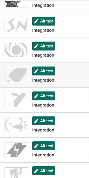
There has not been much effort put into the alt attributes for the images either. Everything has either been given an empty attribute to be decorative or simply the same alt text.
Those are just the basics so far. If they had been met, I would have looked for further details, such as in the newsletter form or run a screen reader over it.
Score: 3/10
Communication design
The language and communication style come across as very professional, almost overly polished for a business context.
Score: 9/10
Ethical Analysis
Now let’s talk about the character of the website, where most websites fail. However, Alby does quite well here.
There aren’t many third-party requests; most come from the website builder “Framer,” which seems to be relied upon too heavily. It likely also brings in the Google Fonts, which is the only Google product here that could easily be replaced by self-hosting (pun intended).
The biggest drawback I see is the representation of the main person responsible for this offering. Their name is not mentioned on the About page, only in the GitHub repo that is a click away. A clear name is part of good practice and is also a requirement when doing business on the internet. The individuals behind the company must be named; hiding behind a company name is not acceptable, especially in the European context when addressing customers from that region, even if the company is not based there.
The same applies to such companies regarding the European GDPR, which must be observed. Just a thought, as I am not providing legal advice.
Otherwise, the terms of use seem fair, and things like the previously mentioned Google Fonts integration are more like minor oversights.
Score: 8/10
Overall Score: 7 / 10

0 Comments