

Overall score: 8.3 / 10
Goal fulfillment
The goal of this website is clearly to attract customers for the WP hosting service. Visitors are encouraged to sign up and start their own blog or website hosted on wordpress.com. The execution is well done.
There is an unmistakable slogan highlighting the key benefit (“Hassle-free WordPress”) and a clear call-to-action button that immediately leads to account creation.
Scrolling down a bit, visitors receive more details about the offering, some beautiful example websites, and the famous testimonials.
The navigation menu is also well-structured, containing all the essential sections that might interest a visitor. A plus point: a clear pricing list—something not always taken for granted. It would be even better if the pricing were displayed directly on the homepage, as there’s nothing to hide. But even so, it’s easy to find.
Score: 10/10
Technical appropriateness
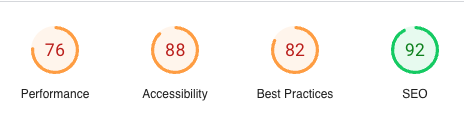
The website itself is built with WordPress, which makes sense in this context—after all, the provider should be using its own product. Google PageSpeed Insights also delivers decent results. All in all, the use of the right technical tools for the purpose can be confirmed here.
Score: 9/10
Visual Design
The visual design is appealing and serves its purpose well. After all, a website of this kind isn’t expected to make bold design leaps. It is modern and up to date. The mobile design is also consistently implemented. A highlight is the mobile navigation menu, which simplifies multiple navigation levels from the desktop version, making it easier to use.
It’s also interesting to see how different pillar pages, accessible via the main navigation, are designed. What initially appears to be minor design inconsistencies actually maintains brand consistency through the use of the same typography. That’s one way to do it!
Score: 9/10
Usability
If the right technical tools are used, a certain level of basic usability is already ensured. All essential browser functions work as expected. As mentioned in the design section, great effort has also been put into structuring the content well. However, there is a pain point in a critical area:
When clicking the CTA link, users are taken to a relatively bare registration page. Some additional effort could have been made here to explain where and why they are registering and what benefits they will get. Users should be able to see the path ahead rather than landing in a bottleneck that obscures their next steps.
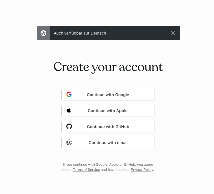
Consider a common office scenario: A user opens the registration page, gets distracted, or is pulled into a meeting. When he returns after a while, he still sees the same bare registration page in their browser. What was I doing again? Why was I signing up? Sure, he can go back in the browser, but that adds unnecessary friction, which can lead to drop-offs.
I would strongly recommend a revision of this page.
Score: 8/10
Accessibility
The accessibility of this website is good. The contrast is appropriate, the tab order makes sense, headings are structured in the correct hierarchies, all images have alt attributes, and as we saw earlier, Google PageSpeed Insights also reports good results.
The only weakness is the forms—various testing tools flag missing labels and ARIA roles.
Score: 8/10
Communication design
The language style and tone of the website are appropriate and typical for this type of business website. It uses a strong marketing tone, almost bordering on incredibility. People aren’t dumb; they recognize it. But they’re also accustomed to this style, so many let it slide.
However, a more personal and honest tone would be more fitting. For example, a comparison between WordPress hosted on one’s own web space and hosting on wordpress.com would be appropriate. I know from personal experience that there are fewer possibilities with the latter compared to the former. Such an approach would be, as mentioned, a more sincere communication style. I’m not sure if this aspect is mentioned anywhere; I couldn’t find it on the pillar pages.
Score: 8/10
Ethical Analysis
Only a few third-party resources are used. Most come from the company itself. The only exception is the fonts, which are from Google Fonts. Given the performance so far and considering the type of provider, one could assume that they could host the fonts on their own servers. A major issue is that the transfer of user data to Google through the use of these fonts is not mentioned in the privacy policy. While it mentions other Google services being used (such as advertising and analytics), there is no mention of Google Fonts.
The cookie consent banner has the typical “Accept all” and “Customize” options common in the U.S. It would be fairer and quicker for the user if there were also an “Reject all unnecessary” option. As it is, the user has to go into “Customize” to disable the analytics cookies. Fortunately, that’s all there is (indicated). And the advertising cookies are disabled by default. At least there’s that.
There is also no clear imprint. I know this is only required in the European region, but it makes sense to name the individuals behind the company. In this case, naming the responsible people would be an honest approach. Hiding behind a company name is something I don’t support, and I can justify this if asked.
Oh, the responsible parties are presented in the press materials. As mentioned, I’m a big fan of listing the responsible person’s name on the imprint or contact page. I only went to the press page for the sake of this test; privately, I almost never do.
Score: 6/10
Overall score: 8.3 / 10
Disclaimer: This test is based on my personal assessment and value system and is not complete or all-encompassing, as it is a free test. Factual errors can be submitted via my contact form, and I will correct them in this test if they are true.
0 Comments