

Overall Score: 7.4 / 10
Goal fulfillment
Coinos is a Lightning wallet provider based on a website, meaning it’s not a mobile app. This allows it to be used on any device with internet access. When I first discovered Coinos, it was mainly focused on brick-and-mortar retail. It has since evolved into a full-purpose wallet. Particularly since Getalby exited the market for custodial Lightning wallets in early 2025, Coinos has gained increasing popularity. This is also true in the Nostr scene, where sending payments with Lightning is a daily occurrence.
Given this background, it’s understandable why the main slogan on the website is “The easiest way to get started with bitcoin.” For a local retailer, the journey begins with earning their first Sats by selling something. For the customer or private saver, however, the journey starts with converting their fiat money into Bitcoin. This can be done either P2P on a marketplace or through centralized exchanges. However, you can’t buy Sats on Coinos. Therefore, this introductory slogan and the fact that you cannot buy Sats there might confuse regular users.
The sub-slogan “A free web wallet and payment page for everyone” fits better for all users. The combination of slogans could be refined and rephrased so that no target group feels misled.
The call-to-action button and everything that follows is, however, perfectly fine. Very fine, in fact, because the subsequent registration form doesn’t even ask for an email address. It only requires a chosen username and password. An email address can be provided voluntarily if one wishes to activate 2FA, for example.
I really like how customers are treated as adults here. This is in contrast to the trend of not trusting customers to set a secure password, which leads to login techniques that send a new login link to the user each time, causing some delays.
Score: 9/10
Technical appropriateness
Since the purpose of this application is the usability in standard web browsers, the use of HTML/CSS/JS is absolutely appropriate. The customer dashboard is implemented as a single-page application, which is also appropriate. Additionally, only a few external services were utilized, specifically just an icon library, which further supports the case for this application.
Score: 10/10
Visual Design
The aesthetics are kept simple and straightforward, which is not a bad thing in this application case. The icons are large, which is noticeable, but not without reason, as we will see in the next testing category.
Score: 10/10
Usability
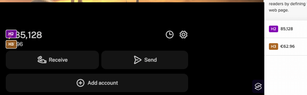
Let’s remind ourselves that the original purpose is usability in a browser on tablets or mobile phones, particularly in stationary sales situations with customers. In that context, large, descriptive menu icons actually make sense. There is nothing to criticize about the outer website, but in the customer area, in the dashboard, there are a few minor details to consider. Here, some important navigation targets, represented by the aforementioned large icons, are presented inconsistently and redundantly. While clicking (or better, tapping) quickly reveals that they lead to the same destinations, they could still confuse the user during their initial visits.
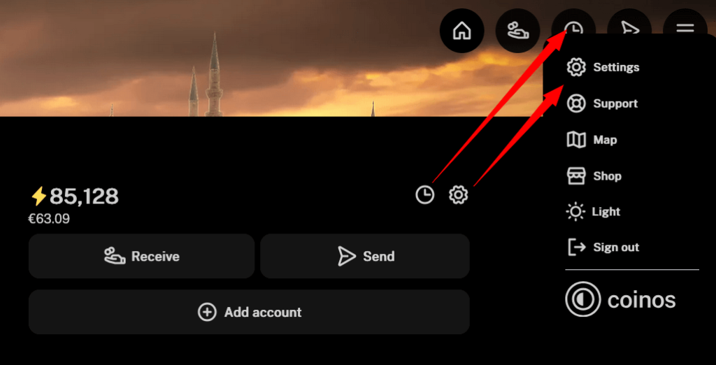
The Receive and Send buttons are also displayed twice in this view. I would suggest moving the Settings icon out of the dropdown menu and placing it at the top in the bar next to the Send icon. The Receive and Send icons at the top of the icon bar should be positioned next to each other, with the icon that leads to the payment history placed to the right of the Send icon. The order at the top would then be: Home – Receive – Send – History – Settings – Hamburger menu trigger. This would make navigation a bit easier.
There are also a few sticking points in the NWC area. The NWC string is something that Nostr users frequently use and therefore search for. While one can guess that this sought-after string is located in the settings, it becomes complicated from there, as this UI presents itself:
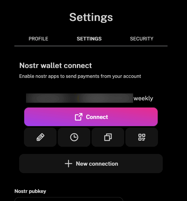
This has something to do with Nostr Wallet Connect, after all, this section has the corresponding heading. Where is the NWC string now? When I tap on “Connect,” nothing happens for me. The first icon in the row of four takes me to a screen where no NWC string is visible. We already know the clock icon; I wonder what it’s doing here again. The third is a copy icon (what is being copied here?), and the fourth is a QR code icon that surprisingly leads to the NWC string. And then you realize that the third icon actually copies this NWC string.
At this point, only the last, fourth icon is really needed. That’s all someone looking for their NWC string requires. All other options do not belong here or in a section titled ‘Nostr Wallet Connect’. I remember that this was better resolved in previous versions.
By the way, many Nostr beginners don’t even know what “NWC” means. Some of them might not realize they are in the right place when they see the abbreviation spelled out.
This should be radically simplified. Everything else should be moved to appropriate sections.
By the way, below that, you can enter your Nostr pubkey. I did that too. But what is it actually for? This is not explained in this screen.
The current tab is not highlighted enough in the tabs at the top. A little bolder is not sufficient. Maybe it should also be italicized?
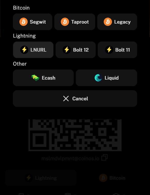
Otherwise, the rest of the user dashboard is self-explanatory. The many deposit options for topping up your Lightning wallet are great.
Score: 6 / 10
Accessibility
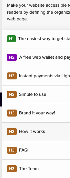
The heading hierarchy on the outer website is fine. But in the dashboard, it is not. There, the page structure sometimes starts with H2 and sometimes with H1.
The forms in the dashboard area are also not designed to be accessible; the ARIA attributes are missing, and the labels are not bound to the corresponding form fields by ID. The external website does have alt attributes for the few images, but they are not particularly descriptive. The dashboard also lacks descriptive labels, as otherwise, the screen reader will not know what numbers are being read out. There are actually too many errors to list them all. For screen reader users, the dashboard is likely to feel difficult to navigate.
Score: 3/10
Communication design
The language and style on the external pages are clear and straightforward. The support is also quick, personal, and precise. However, the dashboard could benefit from some descriptive text between the forms. Everything here still feels very raw and developer-centric. There is too little communication and description.
Score: 7/10
Ethical Analysis
The Coinos website is pleasantly privacy-friendly. Only one external resource is called, and it is solely for a design element, namely the icons. These are also open source and do not set cookies or track the user. This also eliminates the need for a cookie consent banner for European users.
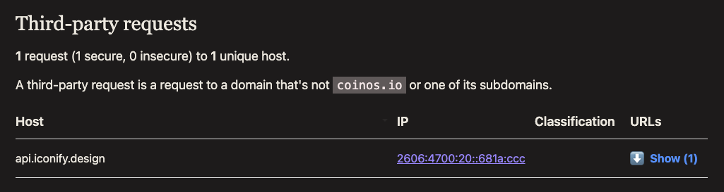
I would question whether I should not prefer to store and integrate these few icons locally, thereby avoiding any external calls. That would be the finishing touch.
The operator of this app is also clearly named in full on the website; you know with whom you are entering into a contract.
However, website operators who offer services to European users are required to comply with the GDPR, or they risk fines if someone is willing to go the distance to pursue it. This means that some additional legal texts are necessary for that. (This is not legal advice, just what I know from personal experience.)
Score: 7/10
Overall Score: 7.4 / 10

0 Comments